Last updated: 2026-02-12
Charts
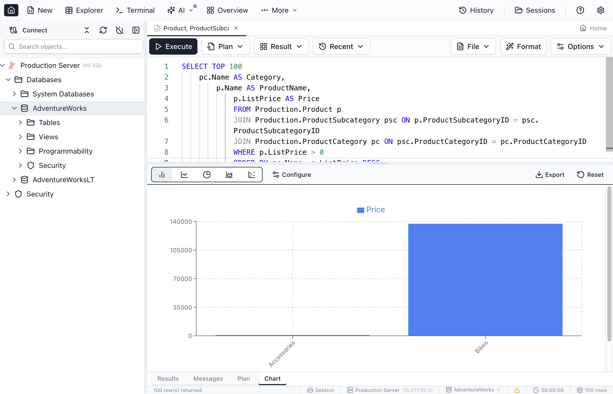
Visualize your query results instantly. Switch from grid view to chart view and turn data into bar charts, line charts, pie charts, and more without leaving Jam SQL Studio.
Creating Charts from Results
Any query result can be visualized as a chart.
Quick Start
- Execute a query that returns data
- Click the Chart tab in the results pane
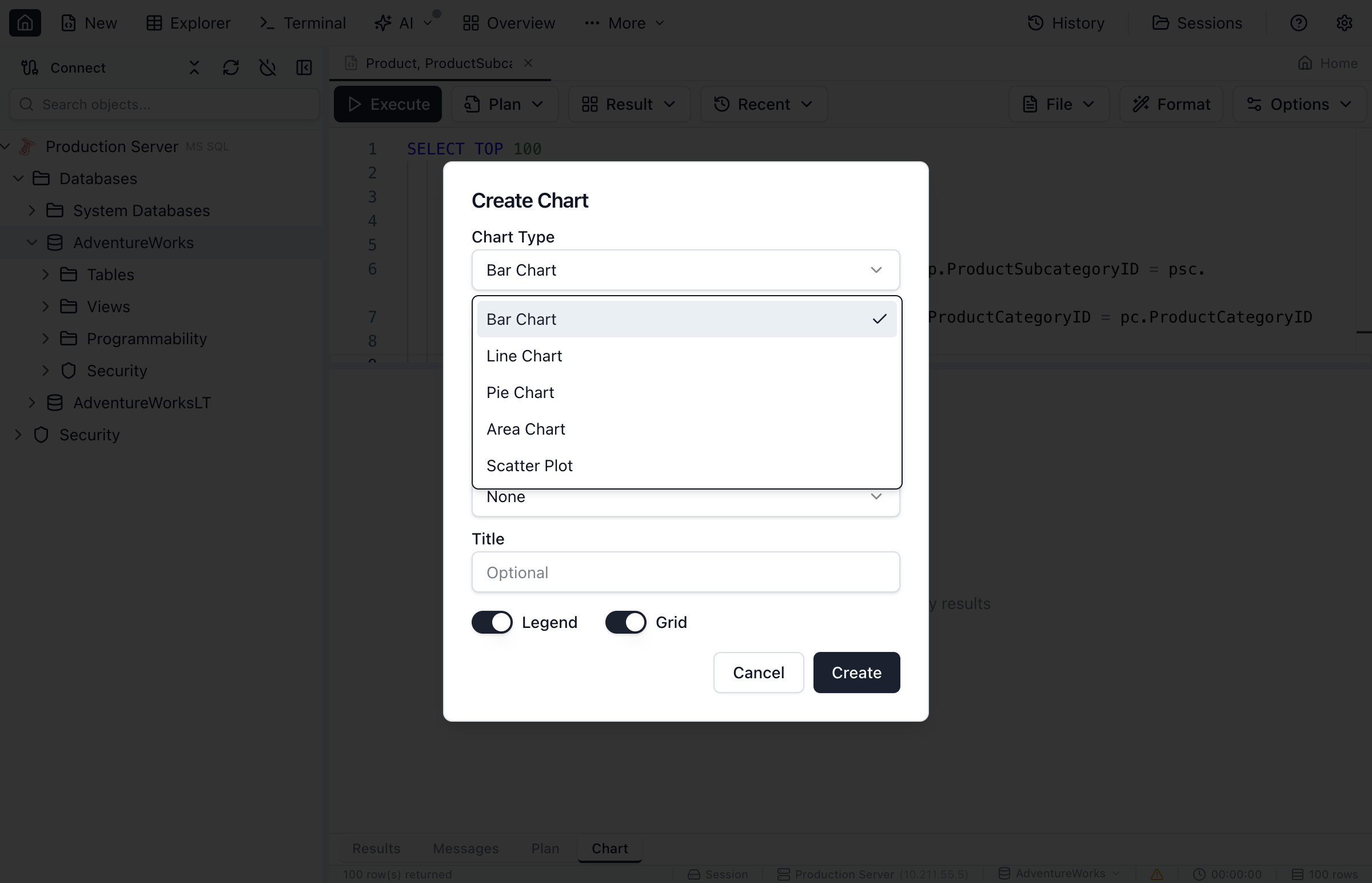
- Select a chart type from the toolbar
- Choose columns for X and Y axes
- The chart generates automatically
Tip: Jam SQL Studio suggests the most appropriate chart type based on your data. You can always change the type if you prefer a different visualization.
Chart Types
Choose from several chart types to best represent your data.
| Chart Type | Best For | Description |
|---|---|---|
| Bar Chart | Comparing categories | Vertical bars showing values for each category. Great for comparing discrete items. |
| Horizontal Bar | Long category names | Bars displayed horizontally. Better when category labels are long. |
| Line Chart | Trends over time | Connected points showing changes. Ideal for time series data. |
| Area Chart | Cumulative trends | Line chart with filled area below. Shows volume and trend together. |
| Pie Chart | Parts of a whole | Circular chart showing proportions. Best with 2-7 categories. |
| Doughnut Chart | Parts of a whole | Pie chart with a hole in the center. Cleaner look, space for totals. |
| Scatter Plot | Correlations | Points plotted by X/Y coordinates. Shows relationships between variables. |
Configuring Charts
Customize your chart using the configuration panel.
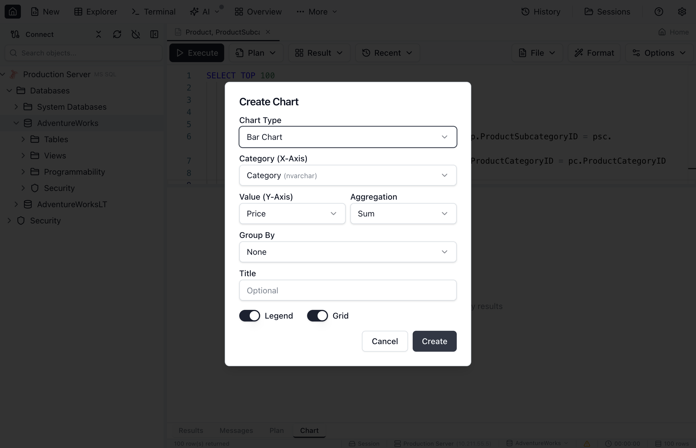
Axis Configuration
- X-Axis Column - Select the column for categories or horizontal values
- Y-Axis Column(s) - Select one or more numeric columns for values
- X-Axis Label - Custom label for the horizontal axis
- Y-Axis Label - Custom label for the vertical axis
Data Series
When you select multiple Y-axis columns, each becomes a separate data series:
- Series Name - Label shown in the legend (defaults to column name)
- Series Color - Click to choose a custom color
- Series Visibility - Toggle series on/off
Chart Options
- Show Legend - Toggle legend visibility and position
- Show Data Labels - Display values on bars/points
- Stack Series - Stack bars/areas instead of grouping (bar/area charts)
- Show Grid - Toggle background grid lines
Working with Chart Data
Data Requirements
For best results, structure your query data appropriately:
- Bar/Line/Area Charts - One categorical column (X) and one or more numeric columns (Y)
- Pie/Doughnut Charts - One column for labels, one numeric column for values
- Scatter Plots - Two numeric columns (X and Y coordinates)
Example Queries
Sales by Category (Bar Chart):
SELECT Category, SUM(Amount) AS TotalSales
FROM Orders
GROUP BY Category
ORDER BY TotalSales DESC
Monthly Revenue (Line Chart):
SELECT FORMAT(OrderDate, 'yyyy-MM') AS Month,
       SUM(Amount) AS Revenue
FROM Orders
GROUP BY FORMAT(OrderDate, 'yyyy-MM')
ORDER BY Month
Product Distribution (Pie Chart):
SELECT ProductType, COUNT(*) AS Count
FROM Products
GROUP BY ProductType
Exporting Charts
Share your visualizations by exporting or copying.
Export as Image
- Click the Export button in the chart toolbar
- Choose PNG format
- Select a destination folder
- The chart is saved at high resolution
Copy to Clipboard
- Click the Copy button in the chart toolbar
- The chart image is copied to your clipboard
- Paste into documents, emails, or presentations
Tips and Best Practices
Choosing the Right Chart
- Comparing values → Bar chart
- Showing trends → Line or area chart
- Showing proportions → Pie or doughnut chart
- Finding correlations → Scatter plot
Data Considerations
- Limit pie charts to 7 or fewer categories for readability
- Use ORDER BY to control the display order of categories
- Aggregate data (GROUP BY) before charting for cleaner results
- Consider using TOP N to limit large result sets
Visual Best Practices
- Add clear axis labels to explain what the chart shows
- Use the legend when displaying multiple series
- Consider stacking bars when showing parts of a total
- Enable data labels when precise values matter
Ready to Visualize Your Data?
Download Jam SQL Studio and create charts from your query results.